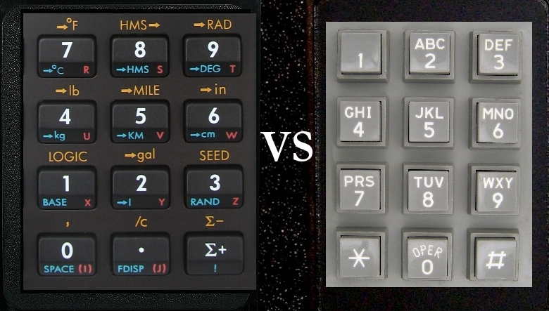
A theory we have often heard is that the phone company intentionally reversed the calculator configuration so that people who were already fast at operating calculators would slow down enough to allow the signals of the phone to register. It's a neat theory, but it isn't true. Even today, fast punchers can render a touch-tone phone worthless.
Both the touch-tone key pad and the all-transistor calculator were made available to the general public in the early 1960s. Calculators were arranged from the beginning so that the lowest digits were on bottom. Telephone keypads put the 1-2-3 on the top row. Both configurations descended directly from earlier prototypes.
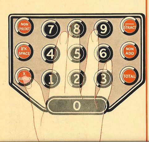
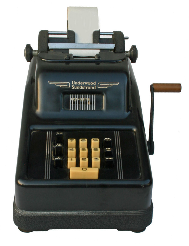
Before 1964, calculators were either mechanical or electronic devices with heavy tubes. The key pads on the first calculators actually resembled old cash registers, with the left row of keys numbering 9 on top down to 0 on the bottom. The next row to the right had 90 on top and 10 on the bottom, the next row to the right had 900 on top, 100 on the bottom, and so on. All of the early calculators were ten rows high, and most were nine rows wide. From the beginning, hand-held calculators placed 7-8-9 on the top row, from left to right.
Before the touch-tone phone, of course, rotary dials were the rule. There is no doubt that the touch-tone key pad was designed to mimic the rotary dial with the "1" on top and the 7-8-9 on the bottom. According to Bob Ford, of AT&T's Bell Laboratories, a second reason was that some phone-company research concluded that this configuration helped eliminate dialing errors. Ford related the story, which may or may not be apocryphal, that when AT&T contemplated the design of their key pad, they called several calculator companies, hoping they would share the research that led them to the opposite configuration. Much to their chargin, AT&T discovered that the calculator companies had conducted no research at all. From our contacts with Sharp and Texas Instruments, two pioneers in the calculator field, it seems that this story could easily be true.
It has also been suggested that if the lower numbers were on the bottom, the alphabet would then start on the bottom and be in reverse alphabetical order, a confusing setup. This might have entered AT&T's thinking, particularly in the "old days" when phone numbers contained only five digits, along with two exchange letters.
Feldman, David (1987),Why do clocks run clockwise?, New York: Harper & Row.
It is pretty odd that a calculator and a touch-tone telephone have exactly opposite layouts for their keypads, which have many identical components. The reasons behind the differences are not known for certain, but a few theories exist.
The first theory deals with the telephone's circuitry and tone-recognition hardware. When the touch-tone telephone was being designed in the late 1950s, the calculator and adding-machine designers had already established a layout that had 7, 8 and 9 across the top row. Data-entry professionals, and others who used calculators fairly regularly, were quite adept at navigating these keypads. They could hit the numbers extremely quickly, which was great for data entry, but not so great for dialing a touch-tone phone. The tone-recognition technology could not operate effectively at the speeds at which these specialists could dial the numbers. The telephone designers figured that if they reversed the layout, the dialing speeds would decrease and the tone-recognition would be able to do its job more reliably. This theory has little proof to substantiate it, but it does make sense.
A second theory refers to a study done by Bell Labs in 1960. This study involved testing several different telephone-keypad layouts to find out which was easiest to master. After testing several layouts, including one that used two rows with five numbers each and another that used a circular positioning, it was determined that the three-by-three matrix that had 1, 2 and 3 across the top was the easiest for people to use.
Another theory is based on the layout of a rotary telephone. On a rotary dial, 1 is at the top right and zero is on the bottom. When designed the new touch-tone keypad, putting the 1 on the top-right didn't make much sense, because Western writing is read from left to right. But putting 1 on the top-left, and the subsequent numbers to the right, did make sense. Using that formula, the resulting rows fell into place, with zero getting its own row at the bottom.
All of these theories attempt to explain why telephone and calculator keypads are exact opposites, yet no one theory can be pinpointed as the definitive reason. It is common practice today to use the telephone-keypad layout when designing new products that utilize a keypad, such as Automated Teller Machines.
from: How Stuff Works
A N S W E R: A wonderful question, gentlemen, and something that I have puzzled over myself. After all, here are three devices that we use on a daily basis, and they all share a basic layout - an array of 10 numbers in a three-by-three arrangement with the zero sitting down below. Yet the numbers are reversed. So what gives? Why aren't all such devices created equal, anyway?
Let's first set the context. The time is the late 1950s. The place, Bell Laboratories, where researchers are preparing to introduce an alternative to the rotary telephone, something they called push-button dialing (which later came to be marketed as "Touch Tone" dialing). The question: how to arrange the numbers.
There were two logical models, of course. The existing rotary phone with its circular dial and counterclockwise number arrangement, with the 1 sitting in the upper right, was one. The calculator was the other. Back then, the industry-standard typical calculator had nine columns of numbers, with 10 numbers in a column, the lowest digits at the bottom, starting with 0 and moving up to 9, and was basically a mechanical adding machine that closely resembled a cash register.
One common explanation for the discrepancy between the phone and the calculator is that phone company engineers intentionally reversed the calculator layout because their research showed that people who were already adept at using a calculator punched the buttons too quickly for the telephone switching equipment to correctly register the numbers. But accounts from people who worked for Bell Labs at the time indicate that this version isn't necessarily the case.
A Case Study
The real answer seems to lie in a study conducted at Bell Labs titled "Human Factor Engineering Studies of the Design and Use of Pushbutton Telephone Sets." Published in the July 1960 issue of the Bell System Technical Journal, the report says that researchers tested a number different layouts including the three-by-three matrix with the zero at the bottom; versions with two rows of five numbers, arrayed either horizontally or vertically; and circular configurations with numbers laid out in clockwise and counterclockwise fashion. The study concluded that the three-by-three version with 1-2-3 in the top row was the easiest for people to master.
There was another reason as well. When it came time to match letters of the alphabet up with the numbers, putting 1-2-3 across the top made a lot more sense because it was the most natural way to get ABC in the top row. If 7-8-9 had been at the top, one of two things would have happened - the letters and the numbers would have run in opposite directions, or PRS would have been the first set of letters. Either arrangement would have seemed very odd, indeed.
All this raises another interesting question. When Bell Labs began exploring keypad layouts in the late 1950s they contacted all of the leading calculator manufacturers to find out why they had chosen to put low numbers at the bottom and high numbers at the top rather than the other way around. The answer, apparently, was a big shrug. It turns out that decision was largely arbitrary: no one had done any research about which layout was most convenient for users. Still, when it came time to place a numeric keypad on a computer keyboard, the calculator model with 7-8-9 at the top prevailed.
Todd Campbell is a writer and Internet consultant living in Seattle. The Answer Geek appears weekly, usually on Thursdays.
From: ABC News.com Tech
Aug 29, 2006
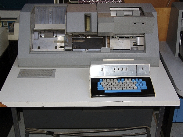
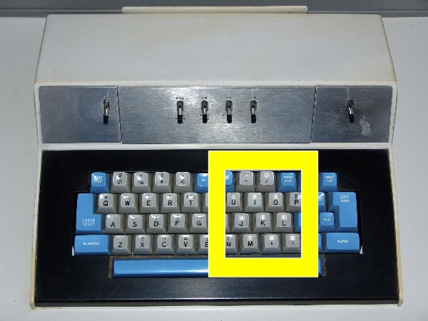
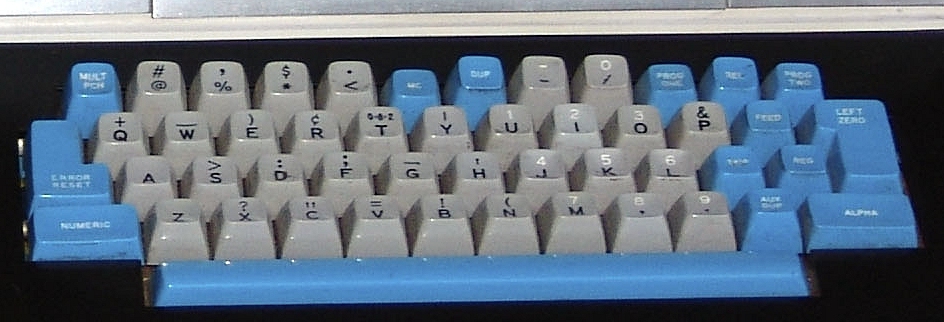
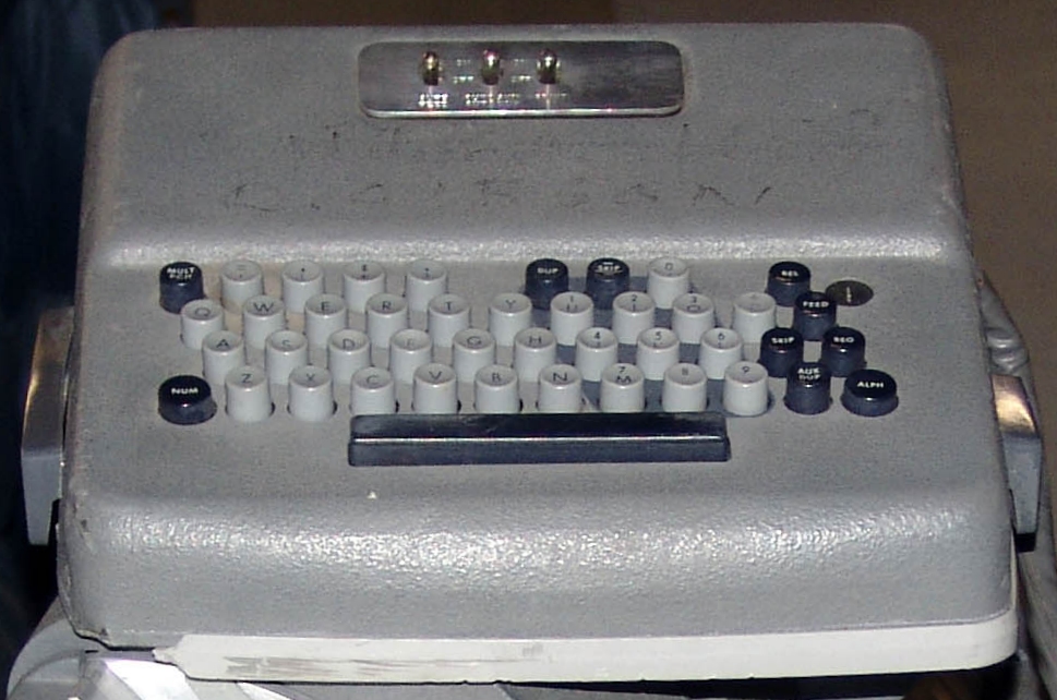
Much has been written about the difference between calculator and phone keypads with the observation that calculator makers seemed to have little to document their choice. As with many of these questions, there probably are more than a single 'correct' answer, as people (including designers) are influenced by subtleties that may be unnoticed. A significant ergonomic difference exists between traditional use of a calculator and a phone. In using a calculator, it is normally on a desk, beyond the current paper work (essentially 'up' above the work focus). Reaching for the calculator, away from the paper, the user encounters '1' first. A phone, by comparison is below the work focus. Typically the receiver is at or near the top, typically the phone is a little below eye level. Travelling from initial focus (grasping the receiver) to the phone keypad, the user first encounters '1', just as might be expected. If you think of the numbers as a transition from normal work focus, it seems that the two keypads reflect the same objective. Just some thoughts. Jay HolovacsJan 20, 2009 My understanding is that the calculator keypad is derived from the keypunch machine (designed by IBM to punch holes in the old fashioned computer data input method) and had been patented by IBM. With unquestioned functionality of one handed numeric keying, Bell Labs imitated the concept without violating the patent by laying the key sequence out inverse to that of the patent.
This was how it was explained as an IBM employee in 1970. - Steve Reed - Interesting but the layouts look about the same to me... All the IBM keypunch machines I'm familiar with have the "keypad" as a shifted function of the main keyboard. Notice the "0" is on the top row of the IBM keyboard.-Rick-